
Key point: When lots of people visit your pages but few sign up, small bumps are usually in the way. Slow pages, busy design and weak buttons push people out. So do generic words, missing trust signs, a hard phone experience and changes made on a hunch. Smooth those bumps one at a time, and more visitors can become leads.
You're sitting in the school pickup line with the engine off, and you open your website stats on your phone. The visitor line went up again this month, and for a second you feel a little proud. Then you check your signup list, and it has barely moved. The proud feeling slips away, and a quieter question takes its place: maybe nobody really wants what I offer.
We've sat across the table from many business owners in that exact spot. In this article, we'll follow a made-up business owner named Carmen Delgado who feels it, too. On a Tuesday afternoon, she sees that hundreds of people visited her service page this month, but only a handful booked a call. We know the frustration and quiet doubt that follow. So we want you to hear this first: your offer is rarely the problem.
Google found that as a mobile page's load time goes from one second to five seconds, the chance a visitor bounces rises 90% (Google/SOASTA Research, 2017). That one finding explains a lot about why your pages get views but few signups. You usually have enough visitors. What gets in the way is the unseen friction between a visitor's interest and their choice to act.
We've spent decades inside Fortune 100, Fortune 500 and Fortune Global 500 companies and small and midsize private firms. There, we watched dashboards, sales data and how people behave online. Coach Shayla led people analytics work and turned numbers into clear answers for senior leaders. Coach Carlton sold software to executive teams and learned what makes a buyer move forward or quietly disappear. Now we help service business owners build sales paths that people actually follow.
Small changes can make a real difference. A faster page, a clearer button and a more personal message aren't marketing tricks. They're the basics, and we've seen them help again and again.
Key takeaways
- On mobile, the chance a visitor bounces rises 90% as load time goes from one to five seconds.
- Busy design and long forms can stop people from signing up.
- A clear button that names what people get gives them a reason to click.
- Words written for one kind of visitor feel more personal than words written for everyone.
- When trust signs are missing, visitors feel unsure and are less likely to sign up.
- Pages built only for a desktop screen lose visitors who arrive on a phone.
Your Website Speed Is Losing You Signups
A page that loads in one second keeps far more visitors than a page that loads in five. That gap has nothing to do with your offer. It's about patience, and most visitors have run out of it by the time a slow page appears.
The story below is an illustration, not a client case. Tom Brennan clicked on Carmen Delgado's ad on a Tuesday morning. He wanted to see her service and maybe book a call, but her page took too long to load. So he left before he ever saw her offer.
He didn't have an objection, a worry about price or any confusion. All he saw was a blank screen, and the back button was right there.
We watched this happen inside the companies we worked for. A slow page doesn't argue with visitors. It quietly removes them before they can decide anything.
What Slow Really Means in 2026
Most business websites are slower than the patience of the people they want to reach.
The research on mobile visitors makes this clear:
- 53% of mobile site visitors leave a page that takes longer than three seconds to load (Google, 2017).
- The chance of a bounce rises 32% as load time goes from one to three seconds (Google/SOASTA Research, 2017).
We call this the silent exit. Visitors don't complain, and they don't email you. They simply leave, and your stats show one more page view with no signup.
The Three Numbers We Check First
Google gives us three measures that matter for speed. We treat them like the vital signs a nurse checks at a visit.
Largest Contentful Paint (LCP) should be under 2.5 seconds, and it tells you how long the main content takes to show up. Interaction to Next Paint (INP) should be under 200 milliseconds. It tells you how fast the page responds when someone taps a button. Cumulative Layout Shift (CLS) should stay below 0.1, and it shows whether the page jumps around while it loads.
Most slow sites share the same causes. They run WordPress with too many plugins, sit on shared hosting or use images that were never shrunk. The fix isn't a mystery. Shrink your images, remove scripts you don't need, turn on caching and use reliable hosting.
Run your site through Google's PageSpeed Insights before you change anything. It names the exact files slowing you down, so you can fix what matters instead of guessing.
Speed isn't a small technical detail. It's the first impression your page makes, and it happens before anyone reads a word of your offer. A visitor who waits is giving you a little trust, and most won't wait long.
Worth sharingWe'd rather have a plain page that loads fast than a beautiful page that loads late. The plain page gets the signup, and the beautiful one gets left behind.
That's the hard math of website speed. It gets even harder when the page finally loads and the design still confuses people.
Confusing Design Stops Your Visitors
Design isn't decoration. Every page is really a series of small choices. When a visitor lands on your page, each part either clears the way or gives them one more reason to leave.
We see this in service businesses all the time. The page loads fine, and the offer is solid. But the layout works against the visitor instead of for them.
Take Carmen Delgado, who runs a small service business. One afternoon, her part-time employee, Juno Park, watched someone try the booking form. Juno noticed what Carmen had missed: the form asked eleven questions before anyone could schedule a call.
That's eleven questions for a first conversation.
Visitors would start the form, scroll, hesitate and close the tab. Nothing was broken in a technical sense, but it was hard in a human sense. It asked for too much, too soon, with no clear path forward.
Worth sharingGood design works like a quiet guide. It shows visitors where to look, what matters and what to do next. Poor design makes them solve a puzzle before they can say yes.
Clutter has a real cost, too. Google found that as a page grows from 400 to 6,000 elements, the chance of a conversion drops 95% (Google/SOASTA Research, 2017).
The reason is simple. A clear order, fewer form fields and a layout built for phones all help. They remove the small doubts that pile up until people give up.
When we look over a page, we ask these questions:
- Does the page have one clear next step, or five competing ones?
- Does the form ask only for what's truly needed right now?
- Does the layout pull the eye toward the action, not away from it?
- Does the layout hold up on a phone without pinching or squinting?
Juno's simple observation cost nothing, but it changed so much. The fix wasn't a full redesign, because Carmen only needed to remove eight of the questions.

We've sat in enough company meeting rooms to know that design talks often turn into opinion contests. Visitors don't care about anyone's opinion, though.
When a button is too small or a form is too long, it isn't a style choice anymore. It's money left on the table.
Decide which one action matters most on each page before you write a single word. A clear call to action helps a curious visitor become a booked call. Pages with lots of views but few signups are usually asking for too many things, or for nothing at all.
Juno noticed something else, too. Every button on the website said Learn More, and that phrase doesn't ask for anything.
It sounds polite, but it gives no reason to click. So Carmen changed the button to Book Your Free Clarity Call and gave it a bold color that stands out.
Soon, more people started to click.
A clear button tells people exactly what they'll get.
When a page isn't working, these are the first things we look for:
- Use one ask per page. A single button beats two or three competing choices.
- Use words that name the benefit. Submit tells people nothing about what they'll get.
- Pick a color that stands out. The button should pop against everything around it.
- Make it thumb-friendly. A thumb should hit it easily on a phone.
Tom Brennan once asked about Carmen's service and then went quiet. He probably didn't leave because he wasn't interested. He left because the next step wasn't clear, and a button that says Submit feels like paperwork. A button that says Book Your Free Clarity Call feels like a conversation.
Keep button words to a few at most. That's short enough to read in one glance and long enough to promise something real.
Pick one action per page, name the benefit in three or four words, and make the button easy to spot.
We also check how the button feels on a phone. If a thumb has to stretch or the words are tiny, phone visitors drop off. That's more than a style issue. It decides who you're willing to serve.
Personal touches can make your buttons work even better later. But clarity comes first, because a visitor can't click what they can't see or understand.
One clear ask has a quiet power. It tells people exactly what to do next.
For most service businesses, the best first ask is one useful free thing. Our Lead Magnet Blueprint helps you plan it in one afternoon. You write your offer in one sentence and test three ideas the same way. Then you pick one and put a date on it, with no design work and no software.
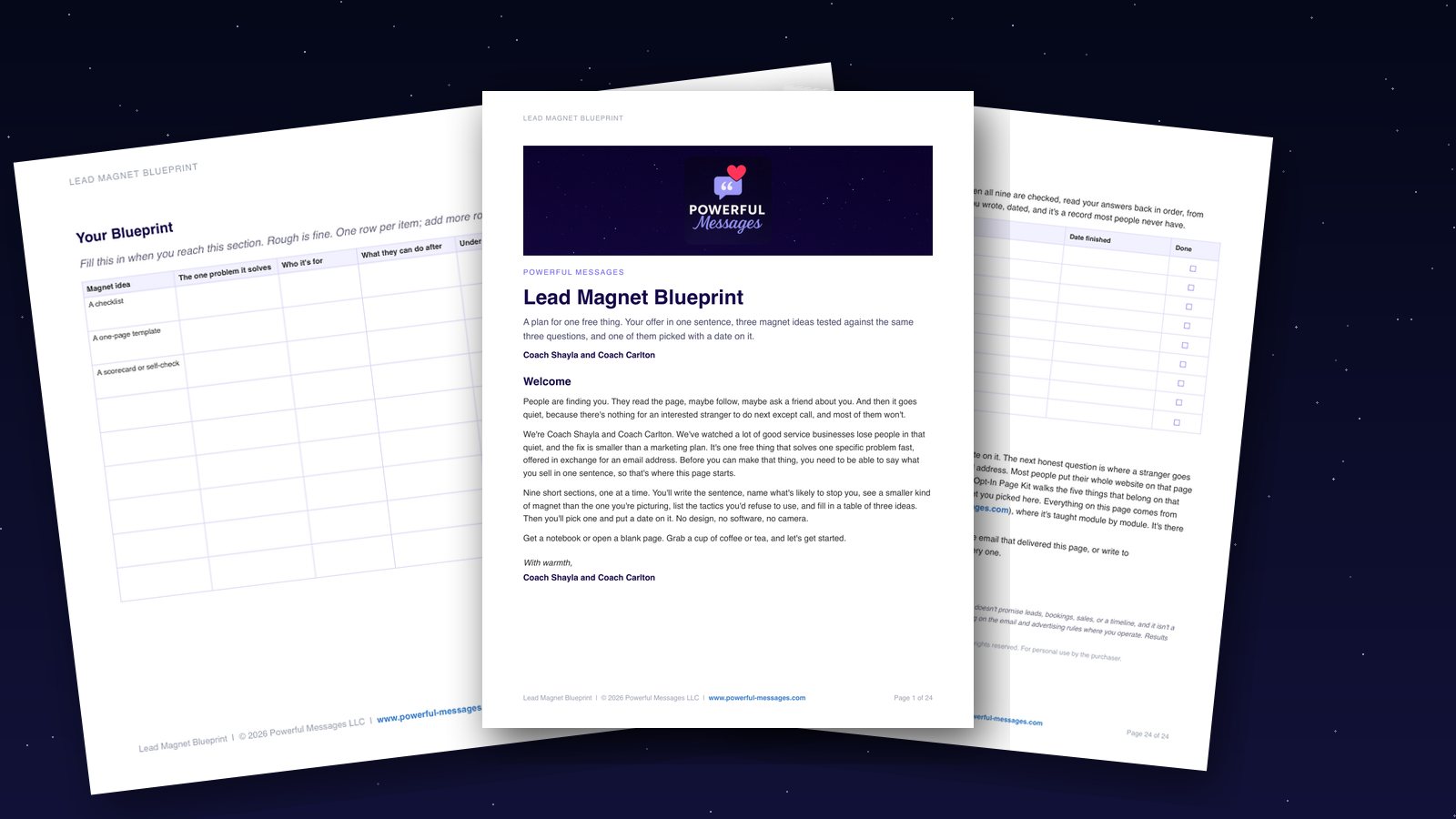
Lead Magnet Blueprint
Plan one useful free step that brings the right buyers closer to you.
Get the Lead Magnet BlueprintYour Messages Aren't Personal Enough
Open your website stats, find the page most visitors land on and ask one question: does this page speak to everyone, or to someone? Generic words are one quiet reason pages get few signups. When every visitor sees the same headline, offer and button, most of them feel the page was written for somebody else.
Relevance is the difference between "this is exactly what I need" and "this isn't for me." We saw this in the companies we worked alongside, too. A page that tries to speak to everyone ends up speaking to no one.
Making a page personal means shaping the words, the layout and the suggestions to fit the visitor. You might shape them by what people do on your site or where they live. You might also shape them by their device or how ready they feel to buy. It doesn't take a giant pile of tools.
Let's go back to Carmen. She notices that visitors from her social media ads act differently than visitors from her blog posts. The ad visitors want proof that she can solve one problem fast.
The blog readers want to learn and understand first. So Carmen uses a tool to show each group a different headline.
The ad visitor sees "Get Your Event Booked in 14 Days." The blog reader sees "How to Plan a Corporate Event Without the Chaos."
It's the same service on the same page, with a different message for each person, and that's the whole idea.
Some AI tools can change what's on a page as people browse. We build our own schools, products and apps with AI every day, and the lesson holds every time: relevance beats repetition.
When we review a page, we ask these questions:
- Does the headline match where the visitor came from?
- Does the page speak to how ready the visitor is to buy?
- Does the button fit what the visitor already knows about you?
- Are you using what visitors told you directly to shape what they see?
The information visitors give you directly matters more as third-party cookies fade away. That includes what they share through forms, email signups and how they move around your site. It becomes your most useful tool for making pages feel personal.
This isn't some future trend. It's the gap right now between businesses that feel personal and businesses that feel like a template. People don't trust a template enough to act.
A page can only speak to someone once you've decided who that someone is. Our Positioning Statement Builder helps you write it down in one sentence. It names who you're for, what you do and why someone would pick you. Every headline on your page gets easier after that.
Visitors Don't Trust Your Website Yet
In 2026, most visitors arrive with their guard up. We see it every time we look over a sales path. People arrive curious, but they leave unsure, so the views happen and the signups don't.
Scams sit in the back of every visitor's mind. They've been burned before, or they know someone who has. So they look for proof that your business is real before they share an email address.
Most people need to trust a brand before they buy. That trust works like a gate, and if your website doesn't open it, the rest of your hard work can't reach them.
What Trust Looks Like on a Page
Trust signals are more than decorations. They're clear signs that your business is real, safe and worth someone's time, and the best ones are simple and specific.
Carmen Delgado gets steady page views, but her signup rate stays flat.
When we look at her site, we spot the problem right away. There are no logos, no reviews and no proof that anyone has ever hired her.
So Carmen adds the logos of well-known companies she's worked with. She also links to her Google Business Profile, where client reviews are easy to see. That isn't showing off, and it gives visitors real evidence that people trust her.
You don't need fifty trust signals, because a few well-placed ones carry most of the weight.
Don't hide your trust signals far down the page. If visitors have to scroll to find proof, most of them never will.
When we review a page, we look for these trust signals:
- Real customer reviews with names and photos
- Client and press logos placed near the top
- Real numbers and outcomes instead of vague promises
- Security badges and HTTPS with a current SSL certificate
- Clear contact details, including a street address
- Honest guarantees and clear pricing
- Real human faces instead of stock photos
Clear contact details are one of the easiest fixes we suggest. A phone number, a real address and a claimed Google Business Profile all tell visitors you're not hiding.
Design shapes trust, too, and it's about looking believable more than looking pretty. A clean, calm layout shows care before anyone reads a single word.
The Spiegel Research Center at Northwestern University found a product with five reviews is 270% more likely to be bought than one with none (2017). Reviews are the strongest trust signal most service businesses already have, yet many never show them.
This gets harder on a phone, because a small screen shows fewer signals at once. We'll come back to that in a moment. For now, remember that trust is the quiet ground every signup stands on.
Your Phone Experience Isn't Ready
The 80/20 rule fits here. Most of your visitors arrive on a phone, while your pages were built on a desktop. Google reported back in 2016 that more than half of web traffic already came from mobile (Google, 2017). Today, Pew Research Center finds 91% of U.S. adults own a smartphone (Pew Research Center, 2026). So many people who land on your page are pinching, scrolling and tapping with one thumb. If that feels like work, they leave.
We saw this inside the companies we worked for. A business owner builds a lovely page on a laptop, and the form looks clean.
The button sits right where it should. Then she opens the same page on her phone and finds a very different picture.
One evening, Carmen Delgado tests her website on her phone. Her signup button is so small that her thumb covers it completely. Her old form still asks eleven questions and makes her scroll past three screens of text.
She closes the tab before she finishes, and she's the owner. That's what a lost signup feels like from the other side.

Google's own data shows that people buy less often on phones than on desktops (Google, 2017). That gap isn't about people wanting less, and it mostly comes down to friction.
Three fixes help the fastest:
- Cut the form to 3 or 4 fields. Ask only for what you need to start the conversation.
- Make tap targets thumb-friendly. A button should be easy to hit with one thumb.
- Place one trust cue above the form. A short review or a client logo near the form helps people feel safe.
Three fixes for a mobile signup
- Cut the form to 3 or 4 fields.
- Make tap targets thumb-friendly.
- Place one trust cue above the form.
People on phones behave differently. They're on the go, they visit for shorter stretches, and they move around with a thumb. They won't squint at tiny words or hunt for a button, because they expect the page to work the way their phone works.
We treat a phone-first design as the starting point, not a bonus. The real question isn't whether your site looks nice on a phone. It's whether a tired person on a train can finish your form in under a minute.
On most sites, they can't. That's why so many page views never turn into signups.
You're Not Testing Your Pages Often
Guessing keeps your pages stuck at views instead of signups. We saw this in the companies we worked for, and we see it in small businesses, too. Owners change a headline, a button color or a form field on a hunch, and then they wonder why nothing moved.
The answer isn't another opinion. It's a simple test that lets real visitors show you what works.
A/B testing compares two versions of a page to see which one does better with real visitors. You split traffic 50/50 between the original page and the new version, so the results are fair. Half your visitors see one version, and half see the other. The winner is the one that gets more signups, not the one you like more.
Carmen wants more email signups from her landing page, so she writes two headlines.
One says "Book Your Free Clarity Call." The other says "Get a Clear Plan for Your Next Event." She sends half her visitors to each one. Then the numbers show her which headline earns more signups.
She doesn't have to debate it or trust a gut feeling.
What to Measure
Testing without the right numbers only adds noise. These are the numbers we look at when we review a sales path:
- Conversion paths: where visitors come in and where they drop off
- Revenue per visitor: whether the winning version really brings in more money
- Event counts: clicks, forms started and signups finished
- Ratios: how many page views turn into actions
Keep a close eye on Revenue Per Visitor. A version can win on clicks and still lose on money, and that's a false win. We want signups that turn into paying clients, not only a bigger email list.
One more thing matters here. A/B testing needs statistically significant data, which means enough visitors saw both versions for the result to be trusted. A test with 20 visitors doesn't prove anything, so let the test run until the numbers are clear.
Tools That Make Testing Simple
You don't need a data science degree. Tools like CartFlows, FunnelKit and WPFunnels work well for WooCommerce sites. PostHog, Wingify and Optimizely also combine A/B testing with personal touches and analytics. Pick one and start small.
Testing turns opinions into real answers. Every section before this one gave you a change to make, and testing tells you whether that change worked for your visitors.
We've watched owners argue for weeks about a headline, when a simple test could settle it in days. What visitors actually do is the feedback that matters most.
So you can let go of the guessing and start testing.
Testing is a skill you can learn step by step. In Sales Funnel Academy, our self-paced school for service businesses, you first build your free offer, opt-in page, welcome emails and booking page. Then you learn to read your numbers and fix the one step that loses people.
You're Not Using Analytics to See Visitors
In 2026, analytics tools can show you exactly where visitors leave. We see too many service business owners working in the dark. They check page views and wonder why signups stay flat, while the answer sits inside tools they already have but never open.
Analytics show you the exact spots where people drop off. That's their whole job. They aren't about big totals that look nice, but about the moment a visitor decides to leave.
Google Analytics 4, Matomo, Clarity, Kissmetrics and Countly all track how visitors move around your site. They show which pages people view, how long they stay and where they leave. Heatmap tools like Hotjar and Crazy Egg add a picture on top. You can see how far people scroll, where they click and the spots they skip.
What Visitor Data Really Tells You
Carmen thought her signup form was the problem. Then she opened a heatmap tool.
On phones, visitors scrolled right past the form. They spent most of their time on her About Us page instead.
That changed everything for her. The form itself was fine, but the path to it wasn't, because visitors wanted to know who she was before they trusted her enough to sign up.

Tools that spot website visitors, like Leadinfo, go one step further. They show which companies visit your site, even when nobody fills out a form. Tom Brennan asked about Carmen's service once and then went quiet. Leadinfo might show that he came back twice last week. That makes him a person to follow up with, not a lost lead.
CRM software like HubSpot and Salesforce links this behavior to real conversations. Juno Park can see which pages a person viewed before booking a call, and that context makes the conversation warmer.
When we review a sales path, we look for these answers:
- Which page people leave from most often
- Where phone visitors stop scrolling
- Which content people spend the most time with
- Which traffic source sends people who actually sign up
Skip the premium analytics plan unless you run several sites. Start with one free tool and learn to read one report well. That beats five dashboards you never open.
Worth sharingMost of the things holding you back are hiding in plain sight. The data only needs someone willing to look.
Small Fixes That Add Up
Page views mean someone showed up. Signups mean they trusted you enough to stay. The space between those two moments is where most pages quietly lose people.
We've walked through the small bumps that explain why your pages get views but few signups. Each one is small on its own. Together, they decide whether a visitor becomes a lead or one more number in your stats.
These are the points that matter most:
- Speed is the first fix. The chance of a bounce rises 90% as mobile load time goes from one to five seconds. If your page takes five seconds to load, you're losing people before they read a word.
- One clear call to action beats three vague ones. Name one next step and make it easy to see.
- Trust matters before anything else can. Reviews, real faces and clear contact details give people a reason to stay.
- Simple words are best. People read at most 28% of the words on a web page, so plain words win (Nielsen Norman Group, 2008).
- Test small and learn fast. You can skip the full redesign and make one change, then measure it against the version you have now.
Picture checking your stats in that pickup line a month from now. The visitor line is still climbing, and this time your signup list is climbing with it. The path finally feels easy to follow.
You can start today with one page. Open your stats, find the page with the most traffic and time how long it takes to load on your phone. Then remove one form field or rewrite one button, and you've taken a real step forward.
If you'd like help with the free offer that starts your sales path, the Lead Magnet Blueprint walks you through it at your own pace.
Small, steady improvements add up to more signups over time. You already know your work is worth finding, and now your pages can show it.
Where to start this week
If you haven't decided who your page is for, start with the Positioning Statement Builder. Then plan your one free thing with the Lead Magnet Blueprint. Each one takes about two hours. When you want the whole path, from first visit to booked call, join Sales Funnel Academy and work through it at your own pace. And if you'd rather talk it through first, book a Discovery call with Coach Shayla and Coach Carlton. It's 30 minutes with both of us. It starts with a small deposit that is credited toward your next call or the 5-Day Challenge.
 Carmen DelgadoA service business ownerMeet Carmen →
Frequently asked questions
Why do my website visitors leave without signing up?
Visitors often leave because of slow pages, busy design or missing trust signals. Google found 53% of mobile site visitors leave a page that takes longer than three seconds to load. A clear call to action and a safe, professional look also help people stay.
How can I make my website feel more trustworthy?
Show real customer reviews, honest pricing and clear contact details. Add security badges, an HTTPS connection and real human faces to your site. Trust signals people can see tell them your business is real.
What's the fastest way to improve my signup rate?
Making your site faster is a quick win. On mobile, the chance of a bounce rises 90% as load time goes from one to five seconds. Shrink your images, turn on caching and use reliable hosting. Then trim your signup form to the fields you truly need, and give each page one clear call to action.
Does my phone experience affect signups?
Yes, it really does. Most people browse on phones, but they buy less often there than on desktops. Easy-to-tap buttons and shorter forms can help more phone visitors stay and sign up.
What should I offer visitors so they sign up?
Offer one useful free thing that answers a question your clients already ask. The Lead Magnet Blueprint walks you through picking it in nine short sections. It comes as a Notion page you copy, plus a printable PDF.
Where can I learn to find and fix the step that loses visitors?
Sales Funnel Academy is our self-paced school for coaches, consultants and other service businesses. You build each piece, and then you learn to read your numbers and fix the step where people leave.
Can someone look at my page with me?
Yes, we'd be glad to. Book a Discovery call and talk it through with both of us. It starts with a small deposit that is credited toward your next call or the 5-Day Challenge.
Sources
- Daniel An, Find Out How You Stack Up to New Industry Benchmarks for Mobile Page Speed, Think with Google, February 2017
- Spiegel Research Center, Northwestern University, How Online Reviews Influence Sales, 2017
- Pew Research Center, Mobile Fact Sheet, October 19, 2026
- Jakob Nielsen, How Little Do Users Read?, Nielsen Norman Group, May 5, 2008
- Philip Walton, Web Vitals, web.dev (Google), May 4, 2020, updated October 31, 2024
Recommended for you
Lead Magnet Blueprint
helps you share a useful first step that brings the right buyers closer.
Get the Lead Magnet Blueprint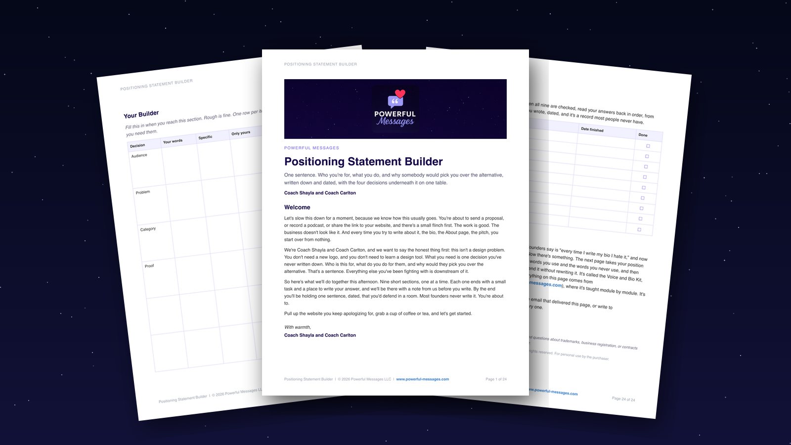
Positioning Statement Builder
helps you say who you help and why your work matters in one clear line.
Get the Positioning Statement BuilderSales Funnel Academy
Build a sales path that books clients
Explore the school